Sale Ends Today! 75% off our annual membership. Get skills that fulfill.

 Rhea
Rhea
We all love that festive time of the year! Although December can be a really busy (and sometimes stressful) month of the year, it also can bring a nostalgic feeling of warmth and excitement that is perfect for inspiring new creative projects!
Here at 21 Draw, we provide our students with a wide range of detailed illustration courses and books that teach them how to embrace their creativity and learn new artistic methods!
To celebrate this festive season, we will be giving you some of our favorite tips and tricks from our amazing artists.
You can follow along with us as we teach you how to create your own festive illustration from scratch! So, without further ado, let’s get into PART ONE: Planning your Illustrations!
Why is planning so important?
Though you might be eager to rush right into drawing, finding the best ideas and reference images to accompany your illustration process can really level up your work! An artwork with well-developed foundations is really going to stand out to its audience! “Using references does not make you less of an artist or less original. They will allow your art more credibility and detail.” – Maria La Malandrino
What comes to mind when you think of Christmas/ Holidays?
Before we can actually get into searching for our reference images, we will first need to decide what our illustration is going to be about.
What we associate with the festive season is going to be different for everyone, so it is important to think about what it means to you specifically. This will really help make the illustration process more enjoyable for you, as well as giving your work that personal touch!
When it comes to December, here are a few of the things that come to mind for me:
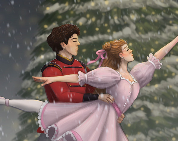
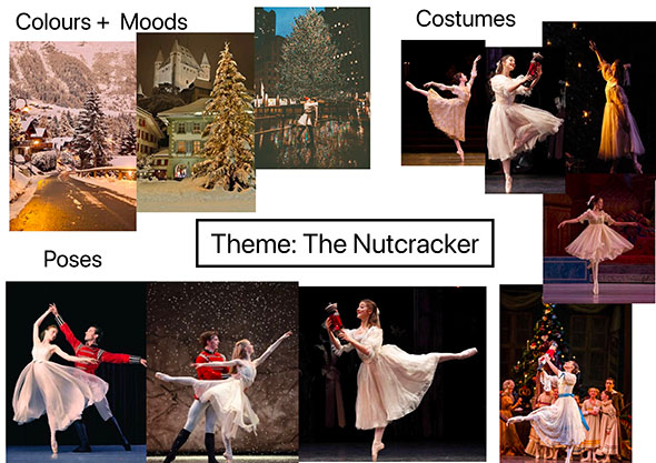
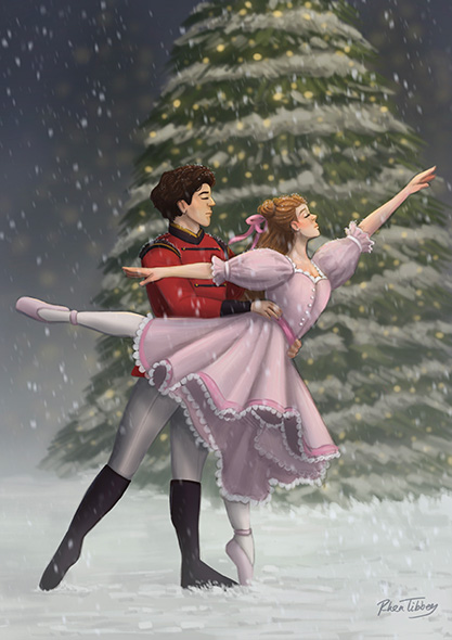
A festive story that I always enjoyed as a child was the Nutcracker (especially the Barbie version, which I know is not necessarily the most accurate), so I have chosen to center my illustration around this theme.
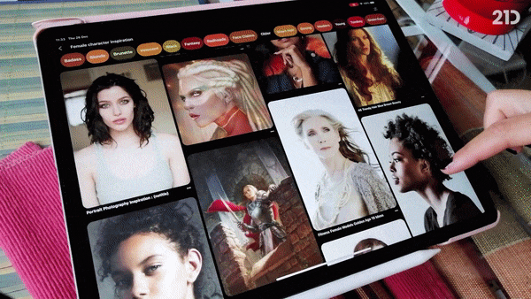
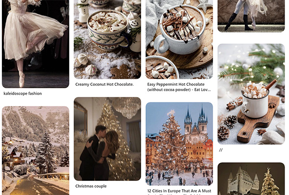
There are so many different methods you can use to find references for your illustration, whether they be through real life experiences like visiting a museum, art gallery or festival or via the internet using awesome platforms like Google Images and Pinterest.
Personally, I like to use Pinterest, it is a simple and to the point website that allows you to ‘pin’ your chosen images to specific mood-boards. This is a great way to keep all of your images in one place.
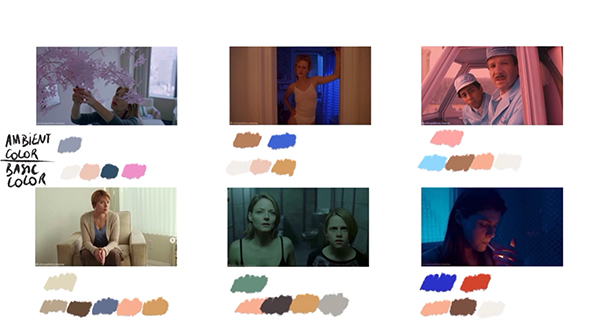
When I am collecting my reference images, there are a few categories I like to look at to ensure I have well-rounded planning for my illustration:
This helps you to establish an overall tone for your illustration and you might find your original idea transforms a little or even completely changes during this brainstorming stage.
This one might seem a little self explanatory, but one of the first things I like to look for are images that have a similar mood, atmosphere, composition or color palette to what I want for my illustration.
As demonstrated by Tony Bancroft in his amazing course “Drawing Character Poses with Personality“, a dynamic pose can add so much emotion and interest to your illustration. Posing can be really tricky, especially when you are trying something new for the first time.
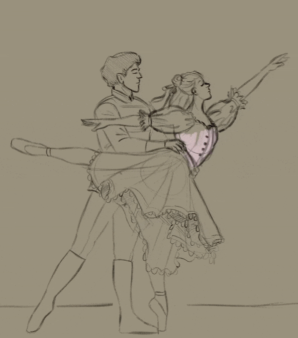
Since my illustration is going to have a ballet focus, I have collected a range of different dance photography images to choose from. Having reference images for your poses can really help your characters look more natural.
So, you have your theme and your character’s pose, but what are they wearing? The human brain is powerful, but it cannot be trusted to remember every single intricate detail of different clothing styles. It is important that you get a few different outfit references to look at while you illustrate!
Achieving your desired lighting scenario purely from your imagination can cause some complications in your illustration process. As seen in Aveline Stokart’s course, “Mastering Lighting & Shading“, having lighting references or completing studies can really help you create more realistic lighting in your work.
Welcome to PART TWO of our Christmas illustration tutorial! We will be providing you with our best tips and tricks from our courses to guide you through the sketching and base-color stages of your illustration.
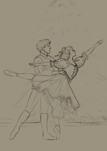
To ensure you are ready to move forward with the tutorial, you should have created a mood board of relevant reference images for your design. Below is an example that I have created for my own exciting Nutcracker-themed illustration. If you have something similar to this, then you are ready to continue!
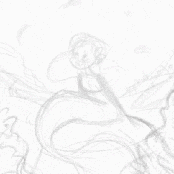
So, now that you have your reference images ready to go, it is time for us to dive into the sketching process! Grab your pose reference, and let’s get started with some tips from some of our amazing artists.
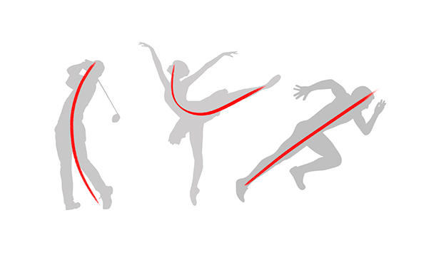
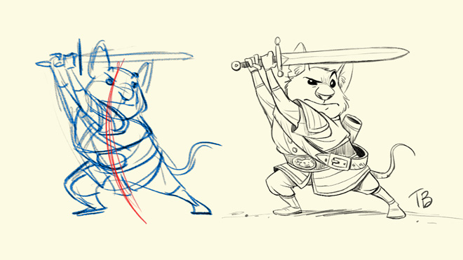
One of the very first things you should be identifying when you are starting to sketch a pose is the line of action. This line should essentially follow the curvature of the pose and give you a general guide for positioning the character’s different body parts.
Often it will follow the character’s spine, but this is not always the case. So, before you sketch everything in, first try to lightly sketch in a rough line of action.
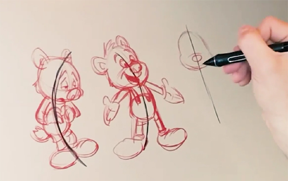
“Line of action is about the gesture and curve of a pose. It helps give a sense of the pose’s direction, emotion, and force.” – Tony Bancroft – “Drawing Character Poses with Personality“
Once you have established your character’s line of action, the next step is to start blocking in the different shapes of the body. The preferred method for this varies between artists, but typically, each key part of the body will be mapped out using simple, often three-dimensional shapes, starting with either the head or torso as a base.
Joints can be signified using small circles to show their placement in between each shape. Below is an awesome method for beginners recommended by our talented artist, Neimy Kanani, in her course, “Figure Drawing for Beginners“.
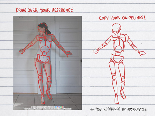
The body should be broken into shapes for the: head, torso, hips, hands, feet, upper arms, lower arms, upper legs, and lower legs. You should be really focusing on your reference pose image during this stage so that you get the right gesture for your pose.
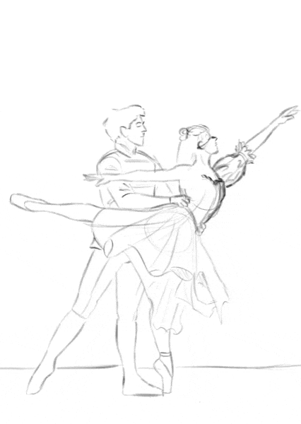
Now that you have the foundations of your character mapped out, you can start adding things like the curves of your character’s body, their costume, accessories and other details.
During this stage of the illustration, you may also start to clean up your sketch and erase some of the structural details when you no longer need them as guides.
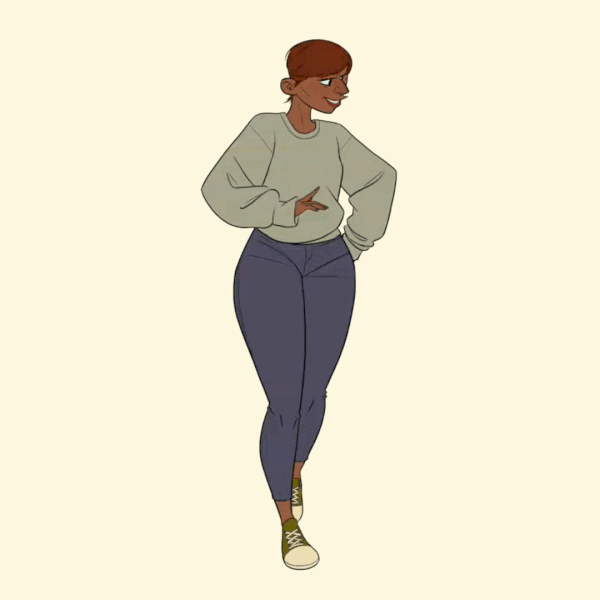
For my illustration, I chose to alter the female character’s costume from the pose reference to something with longer sleeves and more lace details.
Once you have completed your sketch, you will be ready to start adding your base colors. These are block colors used to represent the general palette you want for your work.
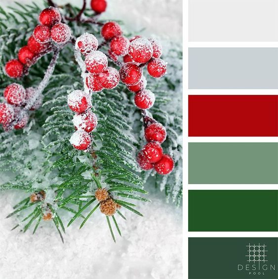
Before you even start laying down your colors, it is a good idea to have a specific color palette in mind. Different color combinations will create different effects.
For example, according to Meike Schneider in her course, “Drawing a Female Character“, complementary color palettes, such as the traditional red and green Christmas colors can be used to create a vibrant, high-contrast illustration.
Your reference images can create inspiration for different color palettes you might want to use.
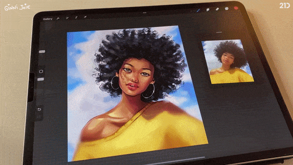
Now that you have chosen your color palette, it is time to start painting in your colors. There are two ways you can do this, painting your subjects using one color for their whole silhouette and then using clipping masks to add details OR painting each of the different colored areas on separate layers.
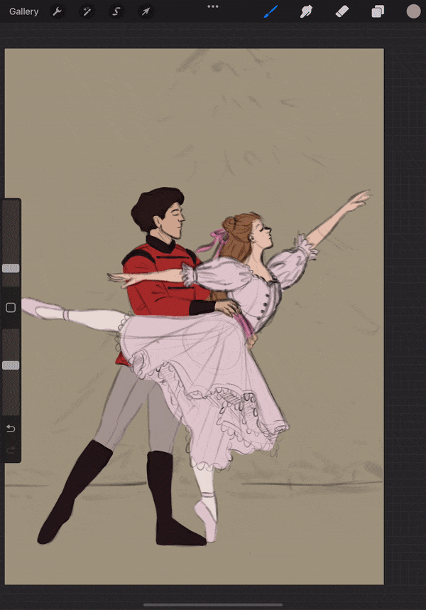
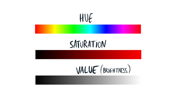
Once all of your colors have been added, you can go back in and adjust any that don’t quite fit the illustration correctly. To do this, simply apply a ‘Hue, Saturation, and Brightness’ adjustment to your desired color layer and alter the colors as required.
Want to learn even MORE about sketching and coloring? Why not try out one of our amazing illustration courses?
In this part of our festive tutorial, we will be getting one step closer to finishing our gorgeous holiday artwork by completing the lighting and shading portion of the process!
Follow along with PRO TIPS from our top courses and learn all about adding color variation, light sources, shadows, highlights, and tons of other details in today’s lesson! Let’s get right into shading!
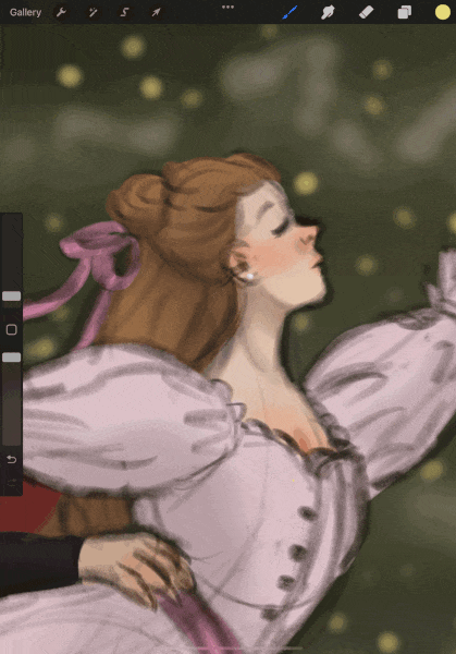
Before we get into shading our illustration, it can help to introduce some color variation to our flat colors. A simple way to do this is to create a clipping mask above your desired layer and then, using a soft brush, start adding in some color variation.
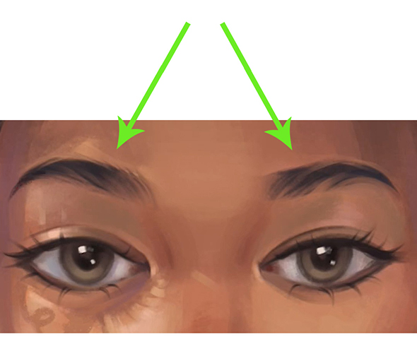
Things like skin and hair will often have the most color variation.
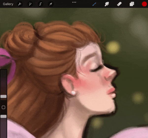
For example, people will typically have warmer tones around their cheeks, nose, and eyes but cooler tones on the lower half of their faces. The way color variation looks will change depending on a person’s skin tone, so it can be good to find references that match your subject’s skin.
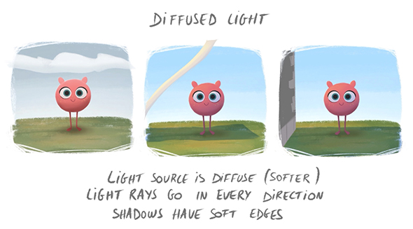
Deciding on the types of light sources you want for your illustration and their position is really important before you begin your shading process. This is because they will affect the types of shadows in your illustration as well as where they fall.
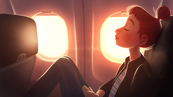
For my festive illustration, I have decided to have three main light sources, all of which will be diffused due to the snowy weather and time of day.
Since my illustration takes place in the early evening, my first light source is the sky, which still maintains some light due to the overcast weather.
Additionally, there will be light from a soft, warm-toned street lamp coming from the top, right-hand corner of the canvas and backlighting from the Christmas tree lights.
Using these three light sources, I can begin to plan out where my shadows and highlights will be in the illustration, as well as any additional color variation.
Step 3: Simple Shadows and Highlights
Now that you have established your light sources, you can start shading! It is up to you whether you shade using a normal layer or a blending layer.
Personally, I like to start with a normal layer and a textured, hard brush to block in my overall shading and then move onto blending layers to fine tune the colors and depth later on.
When you are adding your first round of shadows and highlights to your illustration, I recommend focusing on specific areas one at a time. I typically will shade the skin and hair first, before moving onto the clothing and the background.
This is a good way to simplify the process as you only have to think of one set of colors at a time. Remember to check that your shading matches your light sources as your shade!
At this stage in the shading process, you should have roughly shaded in all of your highlights and shadows.
Don’t worry if they aren’t perfect at this stage, because we are about to fine tune them! A great, simple way to do this is using blending modes! According to our amazing artist Aveline in her course, “Mastering Lighting & Shading“, different blending modes are going to be useful for different kinds of shading:
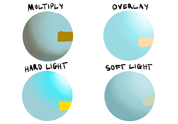
NOTE:To use blending modes, simply create a new layer/ clipping mask above your base-color layers and set it to your desired blending mode in your layer options.
This process is a good opportunity for you to experiment with different blending modes and find what works best for you! Just remember, you want your shading to have both a depth of color and contrast. The edges of shadows and highlights may also be more saturated in color than their surrounding areas.
How did you do with your lighting and shading?
For the fourth and final part of this illustration challenge, we will be learning how to add the finishing details to our work! I am sure you are eager to finish your awesome drawing, so let’s get right into today’s steps!
Color pick the lightest colors from your sky and use them to add atmospheric fog between each layer of your environment. A soft brush set to around 20% opacity will work best.” – Philip Sue A great method for tying together all the elements in your illustration is to add some atmospheric details to your work.
What you choose to add will depend entirely on where your illustration is set. For outdoor illustrations, you might want to add things like fog, snow, rain, light rays, depth to shadows, highlights, atmospheric blur or desaturation of background details. For indoor artwork, you can try things like
lighting effects, increasing foreground details, and blurring parts of your background for effect.
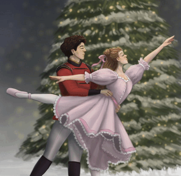
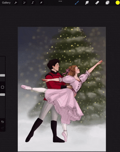
Since my illustration took place outside, I decided to add some atmospheric fog around the base of the characters and background objects, as well as some falling snow with motion blur effects applied.
During this stage in the illustration, I also rendered more of the environment and added a glow effect to the fairy lights on the Christmas tree.
According to the pros, the focal points in your illustration should contain the most detail. This is because highly-detailed areas of your illustration are much more likely to draw a viewer’s attention.
For most illustrations, the focal point will be your subject, particularly their face, as well as any other key story-telling elements in the image.
For my festive Nutcracker illustration, I wanted the focal point to be the faces of my two characters. To achieve this, I ensured that their faces were the most rendered elements in my illustration.
Additionally, I added extra eye-catching details, such as single strands of hair and snowflakes to frame their faces. Other ways you can create this effect include adding defined highlights to your subject and highly rendering their eyes, mouths, nose, etc.
NOTE: Any area that you highly render with lots of detail in your illustration is going to draw focus, so be careful not to over-detail areas that aren’t focal points. If this happens in your background, you can always try fixing it using a blur filter such as ‘Gaussian blur’ to remove some of the detail.
You are so close to finishing your illustration! All we have left to do is add our final adjustments. These will help tie everything together in your illustration. Final adjustments are covered in detail by Aveline in her “Mastering Lighting & Shading course“. A few different adjustments you may want to try out include:
Hue, Brightness and Saturation: These settings can be really helpful for finalizing all of the colors in your work and add some additional vibrancy where needed. You can also use this opportunity to ensure your illustration has the brightness/darkness you intended.
Overlay Tint Layer: Add an ‘Overlay’ blending layer over the top of your entire illustration and fill that layer with one of your main theme colors. Decrease the opacity of this layer to something around 10-15% (or whatever looks best to you), and you should now have a subtle tint over the whole illustration. This is a great way to make all of the colors in your illustration feel even more cohesive.
Vignette: Using a ‘Multiply’ blending layer and a soft brush, you can add a subtle vignette around your subjects. This can be great for low-lit, moody illustrations. Adjust the layer opacity to achieve your desired effect. Colour-Dodge/ Overlay Glow: Using a soft brush on a layer set to ‘Color Dodge’ or ‘Overlay’ (depending on your preference), you can add a gorgeous Halo glow coming off reflective areas of your subjects, such as their skin and hair. This effect can be as subtle or as bold as you like, depending on the lighting in your illustration.
Congratulations! You have created an entire festive illustration from start to finish!!! This festive season is the PERFECT time to explore your creativity and learn new artistic skills with one of our amazing courses.
Check out our awesome festive deals on our website!!
Rhea
Rhea is an Australian concept artist who is currently studying at Griffith University. She is passionate about spreading her love of art to others.


 Gift Cards