Sale Ends Today! 75% off our annual membership. Get skills that fulfill.

 21 Draw
Imagine standing before a masterpiece like Leonardo da Vinci’s “Mona Lisa.” What makes this painting so mesmerizing?
One reason is the composition. Composition is an essential element of a visually captivating piece.
This blog post will explore the concept of composition in art. We’ll also discuss some elements and principles of composing artwork and how they can help improve your art.
By understanding the fundamentals of composition and learning to apply them in practice, you can make your artwork dynamic and engaging.
Composition is the arrangement of visual elements, such as line, shape, color, tone, texture, etc., in a work of art.
Good composition helps create harmony and balance in the artwork. It guides the viewer’s eye through the painting and conveys a message or meaning behind it – in other words, it captures the viewer’s attention and engages them.
The elements of composition include line, shape, color, tone, texture, and more.
Let’s explore these elements.
Lines are fundamental in art composition.
Lines come in all forms imaginable – they can be curved, straight, thin, thick, and so on.
They are used to create movement and give direction. They guide the viewer’s eye and contribute to the artwork’s structure.
Lines can create powerful and dynamic compositions with color, texture, shape, tone, contrast, and balance.
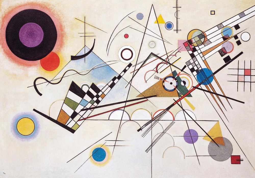
For example, in the abstract painting “Composition VIII,” Kandinsky uses curved, straight, diagonal, and intersecting lines to create movement, rhythm, and depth. The lines guide the viewer’s eye across the canvas, leading to different focal points and forming a dynamic composition.
Shapes are enclosed spaces formed when lines meet or when areas of color, contrast, and texture intersect.
Shapes can be geometric, like squares and circles, or organic, resembling natural forms like plants and animals.
They add depth and interest to an artwork. Shapes serve as a unifying element that binds all other compositional elements together.
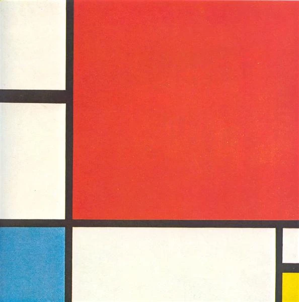
A notable example is Piet Mondrian’s “Composition with Red, Blue, and Yellow.”
In this work, Mondrian uses simple geometric shapes, arranging squares and rectangles in a balanced grid. These shapes and the primary colors of red, blue, and yellow create balance, harmony, and order.
Form in art is a way to make things look 3D on a flat canvas. It is done with the help of perspective, shadows, and highlights, creating the illusion of depth.
In other words, form comprises lines, shapes, color, and texture.
In sculpture, form is tangible, while in painting or drawing, form is created through techniques that suggest three-dimensionality on a two-dimensional surface.
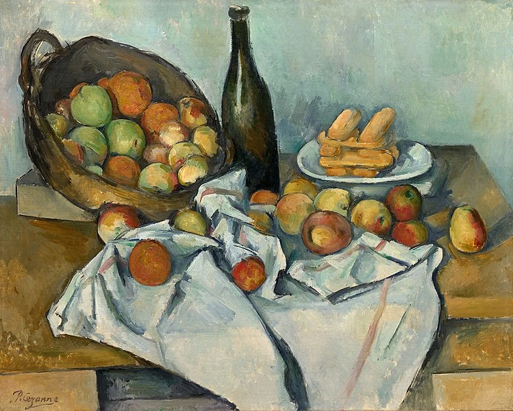
In the painting “Basket of Apples,” Cézanne uses cubes, cylinders, spheres, and other shapes to represent objects in the painting. His manipulation of form adds realism and contributes to the composition’s dynamic nature.
Color is one of the most expressive elements in a composition. It creates harmony, contrast, and depth.
Color brings attention to specific parts of the work and guides the viewer’s eye.
Beyond aesthetics, color also acts as a symbol or metaphor in artworks. For example, blue might symbolize serenity, while red could represent passion or anger.
By strategically using color, artists can convey meaning without using words.
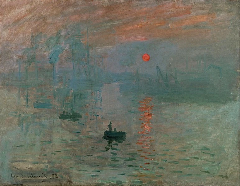
“Impression, Sunrise” by Claude Monet is an excellent example of the expressive use of color in art.
Monet strategically uses warm oranges and yellows around the sun, contrasting them with cooler blues and grays. This contrast, along with his use of short brushstrokes, makes the sun stand out and appear luminous against the rest of the scene, drawing the viewer’s eye to it as the focal point.
Explore our “Introduction to Color Theory” course to understand how colors can convey rich meaning and enhance your artwork.
Value refers to how light or dark something is in a painting. It’s all about the contrast and depth it brings, setting apart the brightest highlights from the deepest shadows and blending various shades in between. This range from light to dark helps to give a painting its sense of realism, texture, and dimension.
Texture
Texture in art refers to the surface quality or feel of an object, which can be either visually perceived (visual texture) or physically felt (tactile texture). This element adds a “sensory dimension” to a composition.
Artists create texture through brushstrokes, layering, mixing media, and digital techniques.
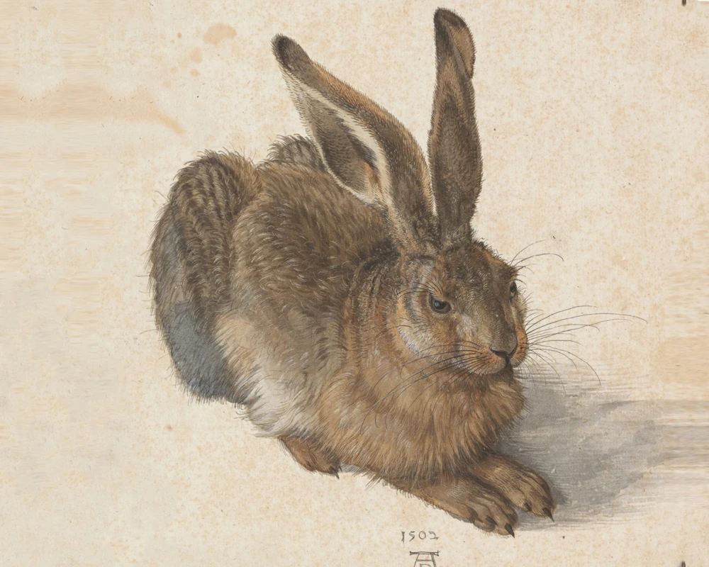
In the realistic painting “Hare,” Dürer masterfully captures the texture of the hare’s fur using delicate brushstrokes and subtle shading. The fur appears soft, fluffy, almost tactile and has a lifelike texture.
Space

Space in composition refers to the areas around and between objects. It defines the boundary and shape of the objects.
It includes positive space, occupied by objects or elements, and negative space, the open areas surrounding them. These spaces play a vital role in creating an artwork’s contrast, balance, and emphasis.
Artists use positive space to represent their main subject, while negative space creates contrast and helps to emphasize the dominant objects.
Albert Bierstadt’s “Mount Corcoran” is a fine example. Bierstadt uses space to create a sense of grandeur and scale.
The vast sky (negative space) contrasts with the mountain and foreground (positive space), drawing attention to the detailed textures and forms and enhancing the overall impact of the landscape.
To create stunning landscapes, explore our course “Introduction to Landscapes.”
Now that we have covered the elements of composition, let’s explore the principles of composition.

The principles of composition are guidelines for creating visually appealing art. These include balance, emphasis, rhythm, movement, pattern, and variety.
These principles help artists create harmonious and compelling works, organizing elements to evoke specific moods or effects.
Let’s look at some of them.
Balance refers to the equal distribution of visual elements within a composition. This can be achieved through symmetrical or asymmetrical design techniques, grouping similar elements, or mirroring shapes and lines.
It’s important to consider how each element relates to the others and contributes to the overall balance of the work. A balanced composition feels stable and aesthetically pleasing, while an unbalanced one can appear unsettling.
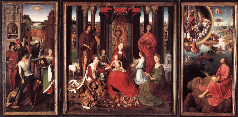
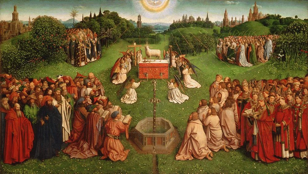
An example of balance is the central panel of “The Adoration of the Mystic Lamb” from the Ghent Altarpiece by Jan van Eyck and Hubert van Eyck, where the symmetrical arrangement of figures and architectural elements creates a harmonious and visually satisfying composition.
Movement is the illusion of, well, movement within a composition. It can be achieved by repeating lines, curves, diagonals, and rhythms.
The goal of movement in a composition is to create a sense of flow, guiding the viewer’s eye around the artwork. This technique helps to generate interest, draw attention to specific elements, and ultimately create a visually appealing composition.
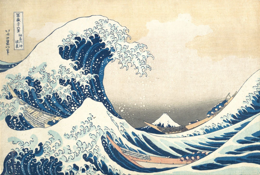
One famous example illustrating movement in art is “The Great Wave off Kanagawa” by Katsushika Hokusai.
In this iconic woodblock print, the artist uses a combination of curved and diagonal lines to create the powerful and dynamic movement of the waves.
Rhythm is created by repeating visual elements such as lines, shapes, or colors. This can create a sense of flow and energy within a composition.
It leads the viewer’s eye through the composition, emphasizing specific elements and guiding their gaze. Rhythm also elicits emotional responses, such as calmness or excitement, based on how it’s used alongside other elements in the artwork.
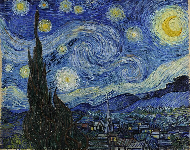
In Vincent van Gogh’s “Starry Night,” rhythmic swirling patterns in the sky and the cypress tree create a sense of movement. These patterns guide the viewer’s eye and give the impression of a dynamic, pulsating night sky.
Emphasis refers to the idea that certain elements within a composition should be highlighted or made more prominent than others.
It creates a visual hierarchy by directing the viewer’s eye to key areas of the artwork.
This effect is often achieved through contrast (light and dark areas), color and value differences, or sharp and soft edges.
Using emphasis, artists can create visually engaging compositions and effectively communicate their intended message.
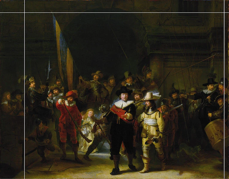
In “The Night Watch” by Rembrandt van Rijn, emphasis is achieved through light and shadow. The contrast between the illuminated figures and the dark background directs the viewer’s attention to the central characters, creating a focal point that enhances the dramatic effect of the painting.
Harmony is the relationship between elements within a composition that creates unity and completeness.
It is achieved when elements like colors, shapes, sizes, and tones complement each other.
For instance, using shades from the same color family or repeating specific shapes can establish harmony. This cohesion allows the composition to flow naturally, creating a sense of balance and unity, which is visually pleasing.
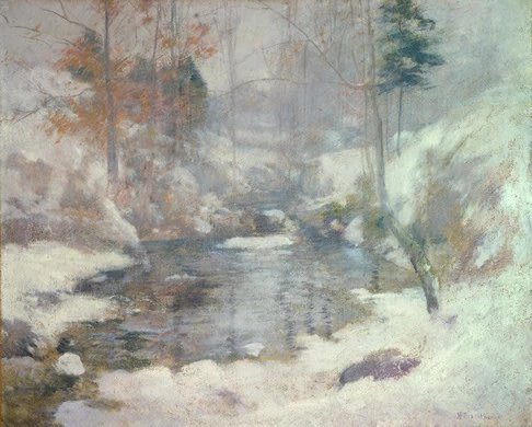
Twachtman’s “Winter Harmony” depicts a serene winter landscape with a limited, cool color palette. The harmonious blend of muted tones creates a sense of unity and tranquility.
The repetition of soft, rounded shapes in the snow-covered scenery enhances this feeling, evoking a peaceful winter scene.
Unity refers to how elements are placed together to create a sense of order and completeness. Unity allows the viewer to connect with a composition by making it coherent and visually appealing.
Harmony and unity are related, but they’re not the same. While harmony is about using similar elements, unity is how all elements combine to create a unified composition.
Variety refers to differences in colors, textures, shapes, and lines and variations in light, shadow, form, scale, and position. It adds interest and captivates the viewer by introducing contrast.
However, overuse of variety can lead to an overwhelming and disorganized composition. Therefore, balancing harmony and variety is crucial for creating an appealing artwork.
Proportion in art refers to the size relationship between objects or elements. Proportion establishes balance, harmony, and unity in a composition.
Proportion also helps create depth and perspective.
By adjusting proportions and scales, artists can make objects appear closer or farther away. Additionally, proportion can convey emotion and movement.
Careful consideration of element sizes can visually express feelings like excitement or tranquility in the artwork.
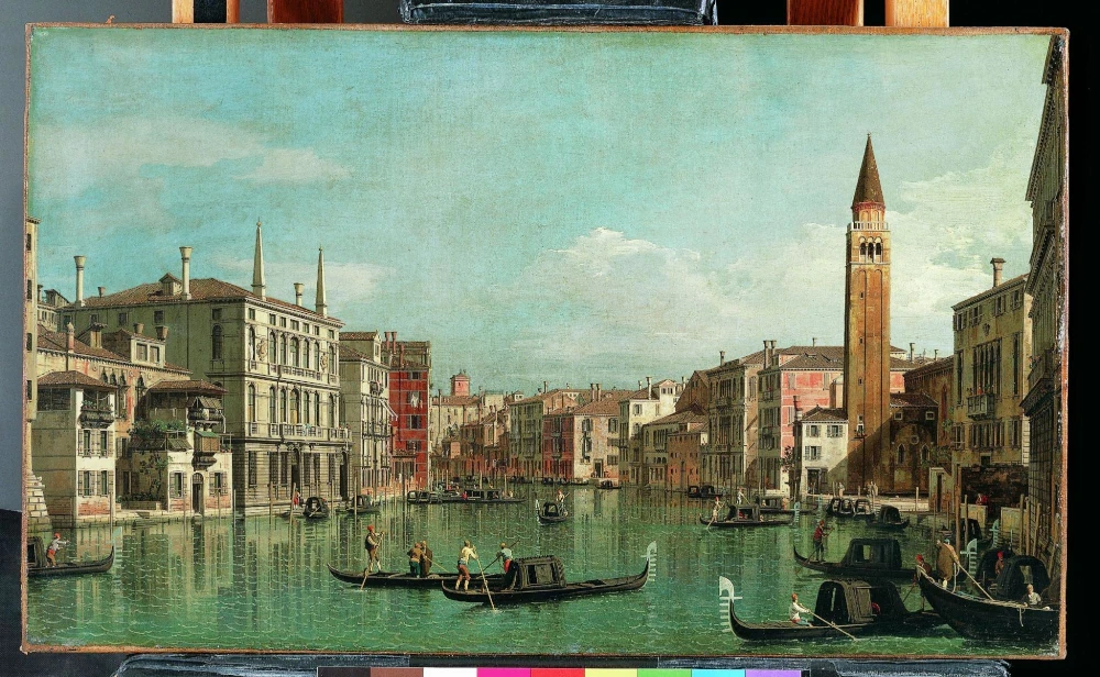
Canaletto’s painting “The Grand Canal, Venice” demonstrates proportion well. The sizes of the buildings and boats are depicted realistically to each other and the scene. This makes the painting look lifelike and creates a sense of depth.
Composition techniques refer to the various methods used to create a composition. These techniques help create a visually appealing, balanced, and unified composition.
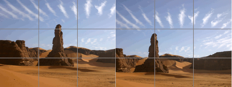
The rule of thirds is one of the most popular composition techniques. It involves dividing an image into nine equal parts using two equally spaced horizontal and vertical lines. This creates a grid with four intersecting points (or thirds).
The primary elements for the composition should be placed along these lines or at the intersection points. This composition technique can create balance and help guide the viewer’s eye around the image.
This technique is widely used by photographers, painters, filmmakers, graphic designers, and other visual artists to compose aesthetically pleasing visuals.

Another composition technique is the rule of odds. This technique suggests that an odd number of elements is visually more interesting than an even number.
The idea behind this composition technique is that an odd number of objects creates a sense of imbalance and thus generates tension in the composition. An image with two subjects may look balanced but lack dynamism, while an image with three or more subjects can create dynamism and excitement.
The rule of odds is often used to draw attention to the main subject and emphasize relationships between elements, resulting in a more visually engaging composition.
The rule of space composition technique involves using white or negative space around the subject to create a sense of movement.
This technique helps direct the viewer’s eye to a specific element, such as a person’s eyes looking in a particular direction. t also creates depth and context by emphasizing relationships between elements.
This technique allows artists to suggest movement or direction.
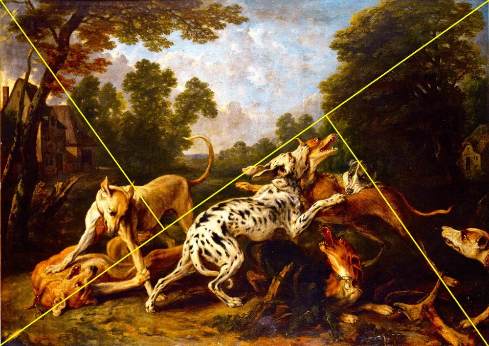
The rule of the golden triangle involves dividing the artwork into four triangles of different sizes. These triangles are created by drawing a diagonal line from the top right corner to the bottom left corner with two additional lines from the other corners, touching the first at 90-degree angles.
The elements can be placed in one of the triangles or along two of the lines to create a more balanced composition. The focal point is often placed in the larger triangle or at an intersection between two triangles.
This composition technique is used to create a balanced and visually pleasing composition.

Simplification reduces visual clutter and emphasizes the main elements within an image.
It involves removing unnecessary elements around the composition, such as background details or highlights that draw attention away from the primary subject.
Eliminating extraneous content will make the composition clearer and easier to understand. Lighting can also decrease clutter and create a more unified composition.
Simplification can be used in photography and painting to create an aesthetically pleasing composition that stands out.

Symmetry is a composition technique used in art and design to create balance and harmony. It involves arranging elements in a composition so that both sides are equal or mirrored. This creates a pleasing visual effect, giving the impression of order and stability.
Symmetrical compositions often use geometric shapes and natural patterns to create a sense of harmony and completeness.
The Golden Ratio is often used when creating symmetrical compositions, as it perfectly balances the composition’s elements. ymmetry can also highlight certain elements in a composition and create dramatic effects.
The focal point is the area of a composition or artwork that captures the viewer’s attention. t can be a single item or consist of multiple items.
A work of art should always have at least one focal point to keep its balance and lead the eye around its composition. Without a focal point, the composition can become cluttered and chaotic, making it difficult for viewers to focus on its main subject.
Our exploration of composition in art has revealed that it is a powerful tool for expressing an idea. It is an integral part of visual art and design, allowing artists to create attractive works that captivate observers.
Whether you are just starting (check out our guide “How to Begin Your Digital Art Journey” if you are starting with art) or have some experience, learning and applying composition techniques to your artwork is always beneficial.
To hone your artistic skills, check out our course “Fundamentals of Drawing.” This course will provide you with the basics of art and help you build a strong foundation.
Also, check out the courses “Mastering Lighting and Shading,” “Drawing Character Poses with Personality,” and “Gesture Drawing” to learn various drawing techniques required for creating fantastic artwork.
You can also check out the list of our online courses and pick the one suitable for you.
21 Draw
Fabulous information! Thank you very much!
Excited to find this information! Thank you!
Thank you Ryan. I will be sharing your page with my senior learners who wishes to understand more about composing a "nicer" and "more valuable" piece of art. Hope they will pick up the courses you have recommended as well.
ReplyColour is not a composition element. It is a big misconception. Think of your composition as of an organization for your painting. It is always monochromatic. Harmony and unity are results of a good composition, not techniques. Line is essential. Repetition, rhythm, direction, tonal values, shapes, contrast and balance. The rule of thirds above is also misleading. It is used by photographers because of the ratio 2:3. It is rather 2/3 of height. Also, the only, but phenomenal use of a negative space are Esher's drawings. He uses it purposely to play with perception.
Reply


 Gift Cards