Sale Ends Today! 75% off our annual membership. Get skills that fulfill.

 Bree Lee
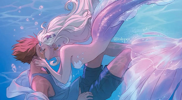
Creating clean, polished line art is absolutely needed for professional-looking illustrations, comics, and designs. However, many of us struggle with shaky, uneven, or messy lines. Whether these are unintentional beginner mistakes or lazy artist habits, we all face these challenges!
Want to build a rock-solid foundation? Check out Mark Kistler’s beginner-friendly courses, “Learn to Draw in 21 Days (Season 1)” or “Learn to Draw in 21 Days (Season 2)”, perfect for getting started. Or if you’re looking for something more advanced, Leonardo Pereznieto’s course, “Realistic Drawing and Shading”, is full of important fundamentals and techniques!
Today, we’ll break down common line art mistakes and how to fix them! No matter what medium you use, the tips you learn today will help you achieve smoother, more confident lines. Let’s go!
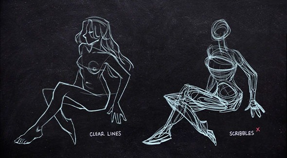
Mistake: Scribbling clutters your drawing and hides your mistakes. This often happens when we don’t take our time.
Draw your lines quickly and with intention.
But wait—didn’t we just say that scribbling happens when we don’t take our time? Drawing your lines quickly doesn’t mean rushing through your work. Instead, it means carefully considering where each line should go before putting it down.
Once you’ve visualized it, draw the line with confidence in a single, swift stroke. By focusing on precision rather than sketching back and forth, your final line art will look cleaner and more accurate!
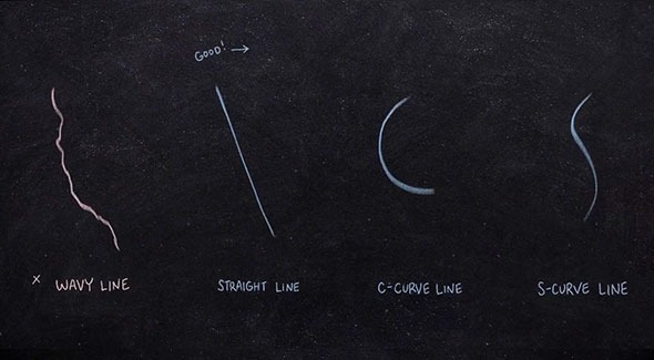
Mistake: Uneven strokes make artwork look unrefined. This often happens when drawing too slowly or without confidence.
Use quick, fluid strokes instead of slow, hesitant ones! Relax your grip and make sure you’re drawing with your whole arm, not just your wrist for a smoother motion. If you’re working digitally, you can adjust your brush stabilisation settings to help stabilize your lines!
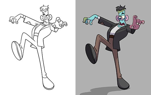
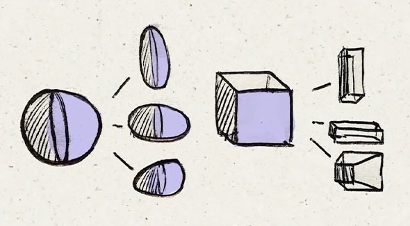
Mistake: Lines that vary too much in thickness can look messy or unbalanced.
Line weight variation is good for creating dynamic line art. However, if it varies too much or is too inconsistent, it will have an undesired effect. To create good, consistent variation, decide on a line weight style first (i.e. thicker outline and thinner lines for details). Then apply this style to every part of your artwork!
For example, if you choose to use thicker lines for areas in shadow, apply this rule across your entire artwork. Thickening the line art for some shadows but not others—can make your art look unbalanced and messy.
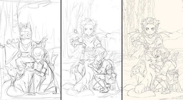
Mistake: Rushing into line art without refining the sketch.
Lower the opacity of your sketch layer and draw cleaner lines over it. If you’re working traditionally, you can use tracing paper over a lightbox or lightly erase your lines to draw another sketch over your initial sketch!
Great line art takes time. Here’s a FREE worksheet you can use with a few different exercises to improve your line control! With consistent practice, your line art will look sharper and more professional in no time!
Would you like more art tips? Watch how Leonardo Pereznieto applies these techniques in the FREE lessons of his course, “Realistic Drawing and Shading”.
Bree Lee
Bree is a digital artist based in California. She enjoys helping new artists grow and loves to create artwork of her own.


 Gift Cards