Promoção acaba hoje! 75% de desconto em nosso plano anual. Aprenda novas habilidades.

 Rhea Tibbey
Quer saber como fazer com que seus temas se destaquem em sua arte?
Com alguns truques simples de teoria das cores, você poderá obter esse efeito sempre! A lição de desenho de hoje é do meu curso “Introdução à Teoria das Cores” – confira para aprender a escolher as melhores cores para suas ilustrações!
Quando se trata de fazer com que o ponto focal de uma ilustração se destaque, há algumas coisas que podemos fazer para influenciar a hierarquia visual de nosso trabalho.
A hierarquia visual descreve os elementos em uma ilustração que guiam os olhos do visualizador pelo conteúdo em uma ordem específica de importância.
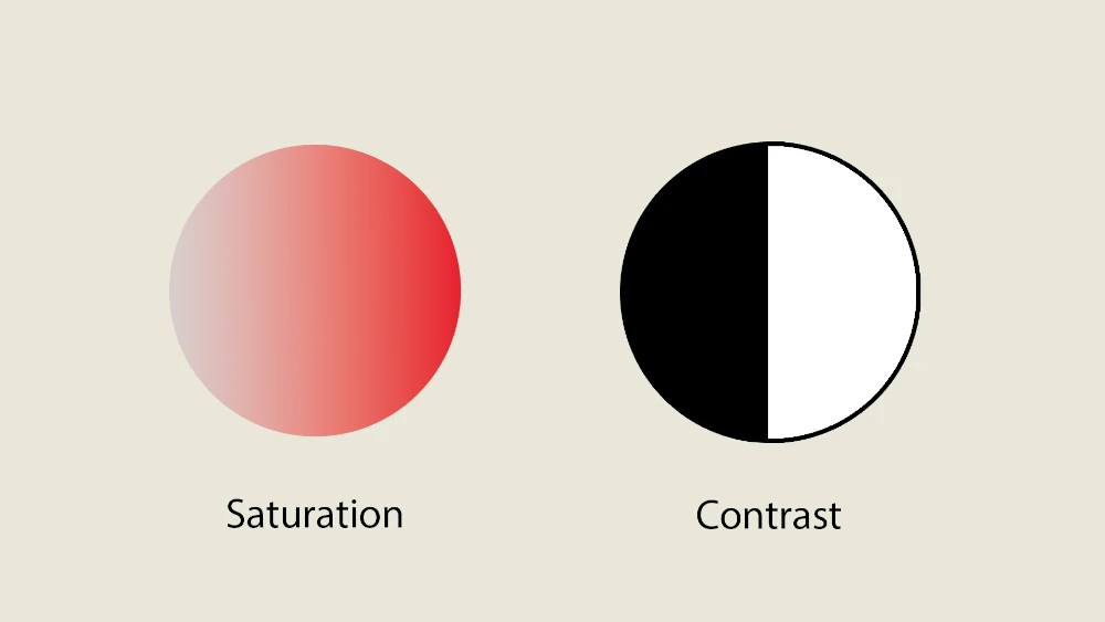
Embora a hierarquia visual seja afetada por uma variedade de fatores, incluindo composição, linhas de navegação etc., a cor desempenha um papel importante. Há dois fatores principais que podemos influenciar quando se trata disso: saturação e contraste.
Então, vamos ver como você pode usá-los a seu favor!
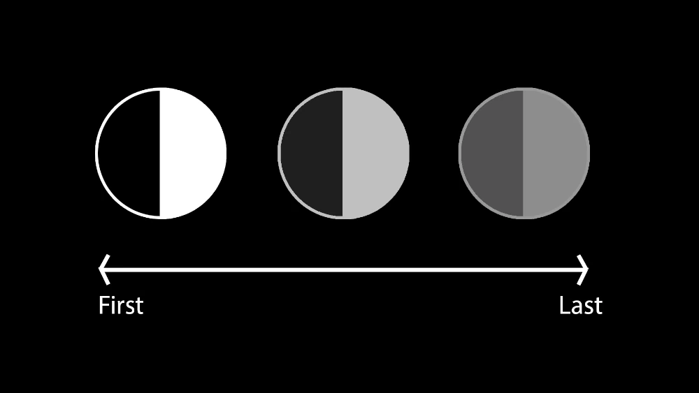
Vamos começar com a saturação.
A saturação descreve o quanto uma cor parece vibrante ou vívida, variando de tons opacos ou suaves a matizes intensos e vívidos.
As cores com alta saturação são vivas e ricas, enquanto as cores com baixa saturação parecem mais suaves ou desbotadas.
As cores mais vibrantes e saturadas em sua ilustração chamarão a atenção do público primeiro, especialmente se essas cores tenderem para o vermelho, laranja ou amarelo (cores de tons quentes)!
Considere um retrato simples de uma das aulas de desenho do meu curso: Eu geralmente procuro fazer com que os olhos sejam o ponto focal. Um método eficaz é aumentar a saturação das cores ao redor dos olhos.
Pegue, por exemplo, duas versões do mesmo retrato: uma com cores dessaturadas ao redor dos olhos e a outra com tons vívidos e saturados.
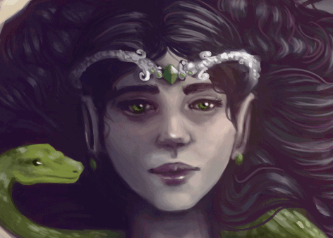
Qual delas chama mais sua atenção para os olhos?
Pessoalmente, acho que a versão saturada é muito mais cativante.
Se você estiver desenhando uma ilustração de corpo inteiro de um personagem, considere maneiras de adicionar saturação ao rosto do personagem. Talvez ele tenha alguns tons quentes nas bochechas ou ao redor dos olhos. Talvez as joias ou o cabelo tenham um POP de cor vibrante.
Por outro lado, diminuir a saturação em outras áreas da ilustração as tornará menos perceptíveis, direcionando mais atenção para os pontos focais.
Para garantir que seu ponto focal realmente chame a atenção, você também precisará considerar o contraste.
O contraste na arte é a diferença entre as áreas claras e escuras em uma imagem. É o quanto uma parte é mais clara ou mais escura em comparação com outra. Alto contraste significa uma grande diferença entre claro e escuro, enquanto baixo contraste significa uma diferença menor.
O contraste de valores pode ser usado para fazer com que as coisas se destaquem, criar profundidade e definir o clima em uma obra de arte.
Assim como as cores vibrantes chamam a atenção, as áreas de alto contraste podem fazer o mesmo. É comum entender que, à medida que um objeto se distancia, seu contraste deve diminuir.
Portanto, é crucial garantir que seus pontos focais tenham o maior contraste e, ao mesmo tempo, minimizá-lo em outras áreas do seu trabalho.
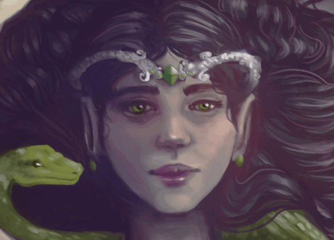
Neste exemplo de retrato das lições de desenho do meu curso, aumentar o contraste ao redor dos olhos e reduzi-lo em outras partes do rosto os acentua significativamente.
Está pronto para testar essas dicas de teoria das cores em sua própria arte?
Por que não experimentar as lições de desenho do meu curso e aprimorar suas habilidades com cores!
Embora não existam regras rígidas, as cores de tons quentes, como vermelho, laranja e amarelo, tendem a chamar a atenção do visualizador com mais facilidade. Entretanto, a eficácia dos esquemas de cores pode variar dependendo do contexto e da intenção da obra de arte.
A experimentação é fundamental. Tente ajustar a saturação e o contraste em diferentes áreas de seu trabalho artístico para ver como isso afeta a hierarquia visual e os pontos focais. Não tenha medo de testar várias combinações de cores, valores e saturação para obter o efeito desejado.
Para obter feedback de um de nossos assistentes de ensino certificados, você pode compartilhar seu trabalho artístico por meio do recurso de fórum da comunidade em nosso site – encontrado em cada curso por meio do botão “Obter feedback” . Além disso, o 21 Draw Community Discord oferece um espaço para que nossos alunos compartilhem seus trabalhos e recebam feedback de seus colegas.
Rhea Tibbey
Rhea é uma artista australiana formada em Animação e Direção de Arte. Ela é apaixonada por ilustração e já trabalhou como produtora e artista conceitual em vários curtas-metragens! Ela deseja espalhar seu amor pela arte para os alunos do 21 Draw em todos os lugares!
gostei muito das dicas vou testar pra ver se dá certo mas tô com tanta certeza que espero que dê certo mas muito obrigado pelas dicas
Resposta


 Vales-presentes