Sale Ends Today! 75% off our annual membership. Get skills that fulfill.

 Bree Lee
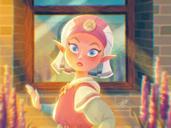
Have you ever felt overwhelmed trying to choose the perfect color palette for your artwork?
With so many colors on an infinite spectrum, it’s completely understandable that you may feel indecisive or even overwhelmed when trying to choose the perfect color combination. How do you know which colors complement each other? How many to use? And how to convey the exact mood you’re aiming for? Luckily for us, freelance illustrator Rhea Tibbey and character designer Meike Schneider break it all down in their courses,Introduction to Color Theory and Drawing a Female Character, where they highlight proven color combinations that will always work. Today, we’re sharing a few of those combinations–let’s dive in!
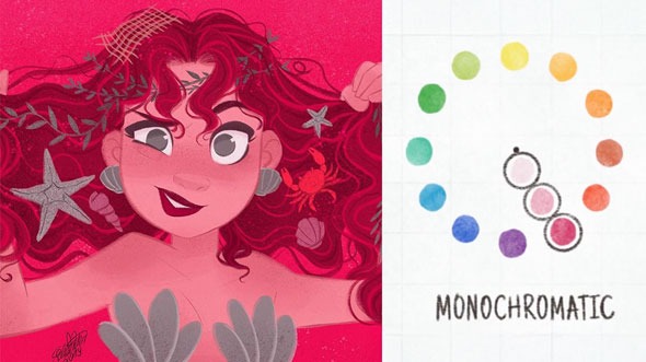
“[It’s] difficult to create an ugly design, since it only includes one color” – Meike Schneider
A monochromatic color scheme is the simplest option as it only consists of one hue! A hue is the purest form of a pigment, untouched by any other colors. To create a monochromatic color palette, choose varying tints, tones, and shades from a single hue!
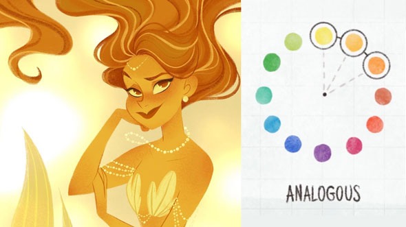
An analogous color scheme is a set of three colors that sit next to each other on the color wheel. In our example above, Meike uses yellow, orange, and an orange-red to establish a lively, cohesive drawing!
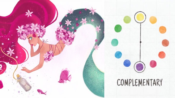
Complementary colors are two colors that are directly across from each other on the color wheel. They are opposites and are perfect for showing contrast! Notice how there is a subtle hint of blue-green in her eye in the sea of pink. Although the blue-green is tiny in comparison to her pink hair, it manages to stand out because of the high contrast!
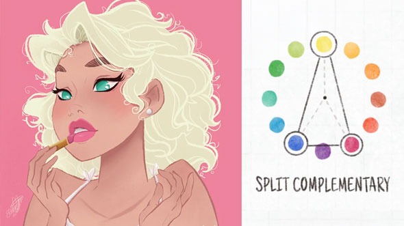
Split complementary colors are a set of three hues. Two of these hues sit next to one of the complementary colors. It’s similar to a complementary color scheme but with a bit less contrast!
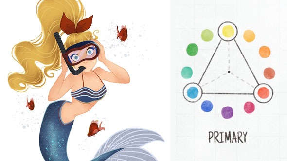
Triadic color schemes are three colors that are equidistant to each other on the color wheel. Perfect for creating harmonic palettes that are high in contrast! A popular triadic color scheme you’ve most likely seen float around are the primary colors: red, blue, and yellow!
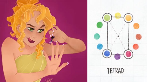
Tetradic colors are two sets of complementary colors, a total of four colors! When using this color scheme, make sure to have one color act as the main, primary color. A color scheme with this many hues will require a good balance between cool and warm colors!
Start with five colors and assess whether you need more or less colors in your palette. Five colors will be plenty for an illustration but if more is preferred or the art piece requires more, by all means, add more! Likewise, if you prefer a fewer amount of colors or you feel your idea is better conveyed with fewer colors, work with less colors!
If you wish to learn more about color theory, access our FREE lessons on color temperature, the color wheel, and color psychology in Rhea Tibbey’s course, “Introduction to Color Theory!”
Bree Lee
Bree is a digital artist based in California. She enjoys helping new artists grow and loves to create artwork of her own.


 Gift Cards